We had a group discussion on where we were at and what needs to be done.
Firstly everyone has uploaded and completed their own individual work, in terms of Summer Holiday Research, Audience research and Textual Analysis of, trailer, poster and magazine.
We have come to a conclusion to who will be acting in our trailer. The drawer will be Jason, who is a student of Christ the King College and is in our media class. He will be the main character, the boy who draws. The girl is going to me myself, Lysette and the unknown killer will be Ayo. We have come to this because we believe it will be the best way to go about our characters and who will fit into that character.
Since that Ali has the responsibility of working on the graphical work in our team, he was able to produce drafts of our film poster. He then showed this to use. He had for different examples of how the poster may look like, then we all voted and discussed our decision and came to a conclusion of which poster we thought would be more suitable for our poster.
We had already come to a conclusion that we will be filming on the 29th of January, however the dates had to be changed.
On the 24th of January we came to a conclusion the we will be filming on the 7th of February, where we will be going to the studio.
Also we have arranged to have a make up session on the 1st of February with Ms Robinson, so that we can practice for the make up we will need to do on the day of out shooting.

Shanice, Lysette, Ali & Moyo
Showing posts with label Lysette Baafi. Show all posts
Showing posts with label Lysette Baafi. Show all posts
Tuesday, 24 January 2012

Tuesday, 6 December 2011
Setting Up, Using The Camera And Tripod


Lysette setting up the tripod and taking into consideration that she has to be careful that her fingers could easily get caught.

At this point Lysette is locking the tripod in the spirit level to ensure the camera is straight and is ready to be used for filming.


********

Lysette has finally set up the tripod successfully

And Lysette has set the tracks on the floor

Moyo and Ali adjusting the tripod, making sure it has been set right and safely


Ali and Moyo were putting the camera in the right position facing the table that Lysette is sitting at, preparing for a shot.


Moyo doing a close up shot of Ali's eye.

This is on another day of Moyo and Lysette Setting up the tripod

Moyo preparing the camera for a shot.

This shot was a paning and tracking shot from behind Ali
Sunday, 20 November 2011
Test Shot
This was my first shot i had ever tried out. Basically we were in class looking at how shots are taken from different angles to show the same thing but what is happening in the shot is fake. When taking this I had to explain to the actors that the slap is not meant to be real, but i will make a clapping sound with my hands to make it more realistic.
Tuesday, 15 November 2011
Treatment
Treatment
We have chosen a working title which we think will suit for the film. The title is ‘Red Ink.’ However we did have other names that we thought could work, therefore there may be a change of the working title during the production and post production of the trailer.
We have also decided on a production team name. The production team name is ‘SLAM Productions.’ ‘SLAM’ acronyms the first letter of our names. When we came up with the name, we all liked it and chose to stick with it.
The format of our teaser trailer will be on film as well as a video. We have decided to do two formats because we would like to make our trailer available on video-streaming websites, such as YouTube.
Our teaser trailer was originally of the slasher genre, but we later found that the story of drawings coming to life is more of a supernatural genre, and so we decided to combine these two sub genres to create a hybrid.
The length of our teaser trailer should be a maximum of roughly 40 seconds. This is a convention that we are following.
The film is about a boy who has a hobby of drawing and this always takes place in a dark room under a spot light. The pictures that he draws seems to come alive and into action. That is what the story is basically about but within our trailer, the boy is going to be sitting in his desk drawing a picture. There will be pictures on the walls that have been previously drawn. He is then drawing a picture, which comes to life. The room becomes empty and a girl walks into the scene. She walks to the table and she picks up the drawing that was left on the table. The drawing is of the girl herself, getting attacked. This comes to life where someone appears from behind her, grabbing her, about to attack her then the scene cuts.
So far, we noticed that people between the ages of 17-24 like slasher horror films and can be proven through our audience research. Therefore we have chosen our target audience to be for the ages of 17-24. We will be finalising this for definite after evaluating on our results of our audience research and receiving more information on why this would be our target audience.
Props that will be used include:
- Costumes
- Killer – Blacked out wearing a hoddie/cape
- Boy – Dark casual clothes/normal looking
- Girl – tank top, jeans; attractive appearance
- Props
- Table – wooden
- Lamp
- Paper
- Knife
- Chair – wooden
- Make up – Blood, cuts
Examples of the props that we will me using have been explained on our blog. This is Just a rough idea of what we will be using.
Monday, 14 November 2011


Audience Research by Facbook


After collecting my results it was seen that the male watched horror films more than the female. he watches horror films at least once a week where as the female watches it one every 3months. However they did both like horror. When i asked the question "What would scare you in a horror film?" The Male said he explained what will scare him in detailed, where as he female just said unexpected events and wasn't really sure. This shows that the male is more into horror and is ready to watch any horror which will scare him enough for him to believe that it will happen to him in real life. Also when i asked the question "Do you prefer the 'unknown' attacking or do you prefer seeing the gore?" Both answered differently. The male would have prefered the gore where as the female would prefer to see the unknown. This tells me that the female does have fear for horror films and the male is scared but at the same time like to see the horror and to get scared by it. From my research I have found out that males do prefer to see the horror, bloody and scarier side of the film even though its scary, but females are scared of horror film and would prefer a film to have more of an unknown part to the film which will be less scary for them.
Ways that we carried out our audience research
 I (Lysette) used facebook to do my audience research where i asked two people, one male and on female. Facebook allows you to send messages people two people instantly for free and to view peoples profiles, but you have to be friends in able to use this.
 Ali Used MSN Messenger to carry out his audience research. MSN is quite similar to Facebook chat because you can chat instantly to one another and can do group conversations on this for free.
 Moyo used Blackberry messenger to carry out his research which is also quite similar facebook and MSN because you can message one another instantly. However the BBM service is only available on the Blackberry phone an to use the service a type of payment has to be done.
Shanice carried out her audience research by asking and writing down the research on paper. We thought that this would be a good idea as it is a totally different way of carrying out research.
Sunday, 13 November 2011
Textual Analysis of a Film Trailer
The Movie trailer that I will be analysing is Insidious which lasts for 1.51 seconds. I will be looking at the camera angles that were used, Editing, Sound and Mise-en-Scene.
The trailer starts with a shot of the working title of the film, which has low key lighting with the name of the title written in black font and the background with red. The background looks like clouds but just in red. This could connote evil and horror.

It then has an editing of dissolving into a shot of the title of the film. This has a black background with the writing in white. At this point there is non-diegetic sound. The sound sounds like either a heart beat or footsteps. This already builds up tension for the audience.
The first main shot is of a man sitting in a chair. This is a medium close up shit. This would tell the audience that this may be the main character of this film. The costume of this man is that he is wearing an ordinary shirt with a t-shirt inside.

It then shows this, (below)
 This may draw audiences attention especially those who have watched the films Paranormal Activity and Saw. Again the background is black which may be connoting evil and horror.
There is then a tracking shot of a house which may mean this is the house of the family. At this point the non-diegetic sound of the beat is still going on.

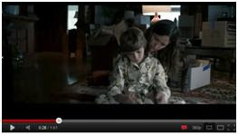 Then there are quick shots showing a normal family during their everyday life. During these shots diegetic sound is used.
 The shots then go onto showing shots of unusual things taking place.
 A low angle sot is then used to shows the mother stopping toy chair which seems to be swinging by its self.
 The camera then tilts up to show the mothers face.
At this point there is non-diegetic sound which builds up tension and at the same time the shot below is being shown which is of a shadow of a woman wearing a veil.

There is then a worms eye view showing the upper floor of the house. This will obviously mean that there is something happening up stairs.

 It then goes onto showing the room of their son. There is a crabbing shot used to show the whole room where there is a weirdly formed body shape of someone standing in the corner of the room. When that figure comes into the shot, non-diegetic sound is used which builds up tension.
 There is then an extreme close up of the a door handle which is trying to be opened and the handle keeps going up and down. Diegetic sound is being used here of the sound of the handle trying to be opened which is also an hard sound effect and at the shame time the characters are shouting in this shot.
 There is then a two shot, which shows what has happened at this moment, which looks like the room that their son was lying in had been turned upside down and on the bed sheet there is a hand print of a hand which is blood stained.
 There is then another extreme close up of a women’s eye which shows here looking up around the ceiling on the house.
Quick shots are used showing un usual things happening and between each shot the title of the film appears. This again builds tension for the audience.
There is then a tracking (dollying) shot of a corridor which uses low key lighting. Again non-diegetic sound is being used.

 At the very end of the trailer it goes completely quite then this appears (below) which scares the audience. It seems to be of a woman running towards the camera and looking straight towards the lenses. The lady looks pale with white hair.
LYSETTE BAAFI
The trailer starts with a shot of the working title of the film, which has low key lighting with the name of the title written in black font and the background with red. The background looks like clouds but just in red. This could connote evil and horror.

It then has an editing of dissolving into a shot of the title of the film. This has a black background with the writing in white. At this point there is non-diegetic sound. The sound sounds like either a heart beat or footsteps. This already builds up tension for the audience.
The first main shot is of a man sitting in a chair. This is a medium close up shit. This would tell the audience that this may be the main character of this film. The costume of this man is that he is wearing an ordinary shirt with a t-shirt inside.

It then shows this, (below)

There is then a tracking shot of a house which may mean this is the house of the family. At this point the non-diegetic sound of the beat is still going on.


At this point there is non-diegetic sound which builds up tension and at the same time the shot below is being shown which is of a shadow of a woman wearing a veil.

There is then a worms eye view showing the upper floor of the house. This will obviously mean that there is something happening up stairs.


 There is then a two shot, which shows what has happened at this moment, which looks like the room that their son was lying in had been turned upside down and on the bed sheet there is a hand print of a hand which is blood stained.
 There is then another extreme close up of a women’s eye which shows here looking up around the ceiling on the house.
Quick shots are used showing un usual things happening and between each shot the title of the film appears. This again builds tension for the audience.
There is then a tracking (dollying) shot of a corridor which uses low key lighting. Again non-diegetic sound is being used.

 At the very end of the trailer it goes completely quite then this appears (below) which scares the audience. It seems to be of a woman running towards the camera and looking straight towards the lenses. The lady looks pale with white hair.
LYSETTE BAAFI
Saturday, 12 November 2011
Textual Analysis of a Film Magazine

I will be analysing a Horror Hound Magazine front cover which focuses on the horror film, “The Walking Dead.”
Masthead: The masthead of this magazine front cover is placed at the top and is very noticeable as the font is big and the colour is black. It also has a red outline which makes the masthead standout, which could connote horror, evil and blood.
Coverlines: There are not many coverlines on this cover and are about three coverlines. The coverlines have been placed along the left hand side of the page, leaving the main image to have a clear view. This could be because the aim was to have the main image to stand out because there are n coverlines overlapping the main image. Also the cover lines have all been written in red. Again this could be connoting horror, evil and blood.
Dateline: The dateline is on the right, just above the masthead. It was published in September/October in 2010. However this doesn’t actually tell us when exactly it was published, therefore it could mean that it may have been published throughout the two months.
Barcode: This magazine has a standard barcode which has been placed on the bottom left hand corner of he cover. It has a website link which is a convention of magazines. Usually this website is the magazines official website link.
Selling line: The selling line of this magazine is, “The Horror Fan’s Magazine.” Usually magazine place this at the very top of the magazine cover, however Horror Hound have placed this under the masthead. The selling line will make a market, as those who are a fan of horror will pick this up as they will feel that the magazine is ideal for them to read.
Main Image: The main image of this magazine is very eye catching. When using the rule of thirds the person has been placed in the middle which makes the main focus of the magazine cover. The image is of a female who looks dead and alive at the same time. She has hardly got a mouth and looks extremely unattractive. However this may draw audience’s attention because it is quite interesting to look at. The image does stand out since there are n coverlines over lapping the picture so it give the image a clear view.
Main coverline: The main coverline of this cover is, ‘The Walking Dead.’ This is the title of a horror film. This tells the audience that this is going to be the main feature of the magazine and is displaying and promoting the film. The text of the coverline has also been written in red which may connate horror, evil and blood.
Tuesday, 11 October 2011
Textual Analysis of a Film Poster (INSIDIOUS)

Film title: Insidious
Director: James Wan
Wrter: Legh Whannell
Release date: 29th Aprl 2011
Synopsis: Insidous is based on a normal American family who have recently moved into a new house, which is fairly old. Their young son has an unknown accident and then falls into a deep coma which cant be explain as there is no explanation to it. The family then start to experience odd and weird event. They then begin to believe that the house is haunted and decide to move to another home which s quite modern and not old like the other house. However, after settling down in their new home the same weird experiences is still happening and getting worse as days go bye. They then decide to seek for help and this help makes them find out that it is not the house that haunted it’s their son. There is only one person to get his son back is the father himself.
The poster has a mixture of key lightening. When you first look at the poster, you actually wouldn’t think that it is a horror film because of the high key lightening that has been used, mainly at the top of the poster around the house. However when you look at it closely, you will then notice a few wrong things about the poster. Even though there has been high key lighting used it doesn’t look bright, but looks quite dull. Also around the poster low key lightening used, which looks smoky and ghostly. This will automatically warn the audience that there is something wrong with the house. The low key lightening does give the poster an effect of mystery.
When looking at the poster as a whole it has a cold look which will make an affect on the audience and making them have different thoughts about the film, which will make them what to find out more about the film.
There are some symbols that have been used in the poster which some audiences may notice and some may not. Firstly if you look closely on the left hand side of the house on the window, you will be bale to spot a figure and the arm of a body. This may already scare some audiences and may actually tease them to go on and watch the film. Also another symbol used is the eyes of the boy. His eyes have been scribbled out and this will get the audiences thinking why has his eyes been scribbled out? There can be many answers to that question. Again this symbol may influence the audience to watch the film.
The main figure of the poster is the boy who has been placed in the middle of the poster and has no facial expressions. The position of the boy can be seen when using the rule of thirds, which is making the boy the main focus of the poster. This may be representing he fact that this boy may be the main character of the film. Also the title of the film has been placed in the middle of the poster but just under the boys head. The font of the title is quite big and the colour of it makes it stand out.
There is one main genre convention used, which is the eyes of the boy. Since this is a supernatural genre the eyes of the boy works well with the genre.
What may drag attention to this poster is the boy in the middle with his eyes scribbled out. This could easily confuse the audience as to why the eyes off this boy are this way and also the skin of the boy doesn’t really look normal or healthy.
The tagline of this poster is, “From the makers of SAW and PARANORMAL ACTIVITY.” Many people have heard about the movies ‘Saw’ and ‘Paranormal activity’ and know what type of movies they are, especially that these movies where successful in the industry. This will give the audience an idea on what the film will be like, s8ince it is by the same makers of other movies that may have been watched. Also audiences who are fans of ‘Saw’ and ‘paranormal activity, this tagline will interest them to watch the film.
On the poster there is a quote from a known person, “SO SCARY I was whimpering in sheer terror (5star). Collin, The News of the World.” Reading the view of another person could influence audiences to watch the film and also the 5 star rating from this person can also influence others.
I believe that the marketing side of this campaign was successful. The poster was displayed on the internet, on billboards on the windows of movie stores, on buses and even in newspapers. The aim was to advertise this film and to tease the audiences on the upcoming new horror supernatural film.
I think that this poster is a good poster as it will communicate effectively with certain audiences who are interested in horror films and those who are especially interested in supernatural films. Just the look of the boy on the poster will get audiences thinking, why are the eyes of the boy like this? Is he possessed? Is he a ghost? It is also a good poster because it doesn’t give away a lot about the film which will draw the attention if different audiences and not only the target group.
Monday, 10 October 2011
Summer Research
The Conventions of Horror:
For the summer holidays i was asked to do some research on Horror films.- In a horror film, there is usually a good person and an evil person. These two people are usually against each other & the two characters conflict.
- There is always a main character and this character usually survives at the end of the film.
- In most horror films the killer has a unique weapon which they are easily recognised with.
- There is usually low key lightening and usually shadows around.
- In most films the main character is a female
- Also at the beginning of the film someone or people die
- There are close ups to show the facial expressions of fear in the faces of the characters
- There are long cut when tension is being built.
- Tension is usually built through sound or background music
- In horror fills the killer or monster of the film has a mask or a weird, scary and not normal look.
- In the settings of many horror film are based in houses , in woods, or in abandoned towns
- The weapon that are usually used are knives, bate or spade
- Silence is used to build tension
- There’s usually loud sound then a bang with is used to scare the audience
- Horror films always include a lot of screaming, shock the killer or monster noises or cry of pain.


Three Different Horror Films:
- Insidious
- Drag me to Hell
- The Hills have eyes
A Horror Film Director:
A horror film director : James Wan
- He was the director of 'Insidious (2011)'
- He was the director of 'Dead Silence (2007)'
- He was the director of 'Death Sentence (2007)'
The Conventions of Horror Film Teaser Trailers:
- Trailers have limited time to build tension and to fright the viewers
- Music used in trailers are usually built up really quickly
- There are usually quick cuts in trailers which show different scenes
- There is usually a scream in most trailers
- There's usually a sound track in most trailers
- Trailers leave the viewer wanting to know more
- After watching a trailer, the audience are usually left with a question, "what happened to him/her?" or "Did he/she survive?"
Writing about a horror Film that i have watched...
The horror film that I decided to watch was insidious. I wasn’t able to watch insidious recently, but I have watched it twice before.
Insidious is a Psychological/supernatural horror film which was released this year.
Psychological/supernatural horror is all about an evil force trying to persecute someone/people and bringing back something that happened in the past. That is what insidious is about.
In the first scene of insidious there is a figure of an old woman creep around the house of the family. Already the film has started with ghostly figures to scare the audience and to get the audience thinking. Later on in the film, Dalton, the son of Rengi and Josh, fall into a coma ands is taken to hospital. This coma was an unexplained comma. Again this gets the audience thinking.
Later on in the film Rengi starts to believe that the house they are staying in is haunted, and that she keeps on hearing noises as if there are people in the house and she even starts to see people in the house which are mostly ghostly figures. This works on the disturbance of human psyche.
Analysing Lighting
I was asked to analyse pictures with low key lighting...


Teaser trailer Storyline
· Two main Characters
· One of them will be the Killer and The other will be the Boy that sketches
· The trailer will start of with the boy in a deserted room with sketches of different scenes of a killer killing people or with its weapon
· The boy will then pick up one of the sketches and then a close up will show the sketch
· That sketch will then come alive, but this will be quick shots of that scene
· Then at the end of the scene there will be a zoom in of the boy still holding the picture, still zooming in but into it face, at this point we can only see the side of his face which seems to have been slightly burnt. The face will be turning around but then there will be a cut where it will show the killer just standing there holding its weapon. And that would be the picture that the boy at the end is holding.
· The killer will be wearing an overall with shackles on their feet. They will have a burnt face. But all over the face. The boy will also have the same burnt but just a little on the cheek.
· Throughout the boy’s scene we will never see the full figure of the boy he will be shot from the back, then it will only be one side of his face that we will see.
Subscribe to:
Posts (Atom)