
Shanice, Lysette, Ali & Moyo
Thursday, 29 March 2012
Planning and Research Question 4
In this video i will be answering the first section on question four.
Wednesday, 14 March 2012
Evaluation Q4 - How We Used Media Technologies in Construction, Research, Planning and Evaluation Stages
PLANNING & RESEARCH
· Used Blogger to post videos, links, images
· Created pie charts to present our audience research
· Used google for example film posters and magazines. Also viewed past blogs on Blogger.
· I’m used to using YouTube so it was easy. Searching up trailers for movies was easy as this is one of the main places films are promoted. Also used it for tutorials, which had helped me with Final Cut Pro.
· Used the internet to research trailers of movies, magazines and posters. Also researching horror directors like James Wan and Alfred Hitchcock, and the common conventions in horror genres, trailers and posters. This helped me to take note of conventions I found in supernatural horror and incorporate this into my own trailer and poster.
· We filmed behind the scenes footage of when we started to experiment with the shots. Also, videos on how we made our products.
· I watched horror movies such as Final Destination, Saw, The Grudge and Friday the 13th for inspiration. I think I benefited the most from Final Destination and The Grudge as I was able to understand elements that are put into a supernatural/psychological horror.
PRODUCTION/FILMING
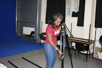
When learning how to film we had to go over the basics of how to use the video camera, still camera, and also the track as the technology was unknown to members of my group such as the Cannon EOS 7D.

We practiced using the camera we did a few pratice shots we used the track to do a tracking shot when we first started it was a bit difficult as we had to keep tracking at a steady pace so the shot was nice not jumpy, by the third attempt it was gradually was getting easy and by the fifth time i had mastered the shot and it was easy.
This was my 1st attempt at doing a tracking shot and I had forgotten about the lighting, lighting which is a key aspect when it comes to taking pictures or filming as without lighting you won’t be able to see most of the shots clearly enough for you to enjoy what you are watching. In this shot we can hardly see anything which is a big downfall as the people watching wont be able to enjoy the shot.
In my 2nd attempt I managed to use some of the lights to make the shot easier to see. It didn’t use a lot as I was trying to go for a low key lighting which reflects that the character is lonely. but there is enough lighting for the viewers to see.

At first we anticipated it would be hard to set up the tripod which is why we decide to do it prior to our filming so it would be easier for us when we had to film therefore saving time.putting the tripods on tracks was sometimes a challenge because of either the tripod may’ve have been broken in an area, or the track was not assembled in a way that we could fit the track Attempting to set up the tripod was the hardest but when my teacher showed me how to do it and it became easier now I and members of my team are pro’s and it is easier.
The main problems we faced was that the studio in kent were we was suppose to film was no longer available as an incident occured which meant the studio was not in further use but this did not affect us as we were still able to film in a different location. also another problem we had when applying light using the equipment was making sure that the light was too bright, because at times the background sheet we used would show, and the shot wouldn’t have the dark, grungy look that we aimed for in our trailer. It may’ve also indicated that we used a light source because of how bright it was. However we didn’t want it too dark because we
MOVIE POSTER & MOVIE MAGAZINE COVER
When learning how to film we had to go over the basics of how to use the video camera, still camera, and also the track as the technology was unknown to members of my group such as the Cannon EOS 7D.
We practiced using the camera we did a few pratice shots we used the track to do a tracking shot when we first started it was a bit difficult as we had to keep tracking at a steady pace so the shot was nice not jumpy, by the third attempt it was gradually was getting easy and by the fifth time i had mastered the shot and it was easy.

In my 2nd attempt I managed to use some of the lights to make the shot easier to see. It didn’t use a lot as I was trying to go for a low key lighting which reflects that the character is lonely. but there is enough lighting for the viewers to see.


At first we anticipated it would be hard to set up the tripod which is why we decide to do it prior to our filming so it would be easier for us when we had to film therefore saving time.putting the tripods on tracks was sometimes a challenge because of either the tripod may’ve have been broken in an area, or the track was not assembled in a way that we could fit the track Attempting to set up the tripod was the hardest but when my teacher showed me how to do it and it became easier now I and members of my team are pro’s and it is easier.

The main problems we faced was that the studio in kent were we was suppose to film was no longer available as an incident occured which meant the studio was not in further use but this did not affect us as we were still able to film in a different location. also another problem we had when applying light using the equipment was making sure that the light was too bright, because at times the background sheet we used would show, and the shot wouldn’t have the dark, grungy look that we aimed for in our trailer. It may’ve also indicated that we used a light source because of how bright it was. However we didn’t want it too dark because we
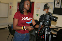
- During recordings, we all took turns to take pictures of the actor(s), behind the scenes etc.


The positioning of the lights was quite difficult as we needed most scenes to be completely dark, therefore not all lighting techniques went to plan. The lights we used mainly consisted of the Diva Lite 400 and the portable Diva Lite 401. Setting up the Diva Lite 400 required a lot of help at first as it was quite tricky to put together, however, we pulled through with practise and was able to set it up and take it done like real professionals.

Our group "Photoshop Master" used mainly PhotoShop when manipulating the magazine & poster. The benefits of Photoshop is that it allows ones creative talent to show. Ali's step by step video of creating our film poster and magazine can be viewed on our blog.

- Websites we used which contributed to our print production/ advertising was:
| Without YouTube, our group teaser trailer wouldn't be viewed and appreciated! |
| Blogger contributed greatly to our print production/ advertising as none of our hard work would have been viewed, recorded etc Blogger is the ultimate deication to our work. |
| Apple (The most important! Without the Apple macs, our group would've have struggled!) |
| These two social networks, helped greatly in advertising our group trailer to friends/ family/ others around the world! |
Health & Safety is important as there is many expensive equipment situtatedaround the working area etc. For information on how our group dealt with Health & Safety, refer to our Health and Safety post:
>> http://slamproductions4.blogspot.co.uk/2012/01/health-and-safety.html

 When following convetions of the magazine, we used Google images to view magazine covers and develop our own ideas, we also viewed past student work to help develop our final magazine cover. By reviewing other magazines, we were able to get a rough idea of how our magazine should look and what could be changed. Also, this proved to be helpful as we were able to follow, challenge and develop conventions when creating our film magazine.
EVALUATION POST-PRODUCTION
Once we had filmed all the appropriate footage that we needed for our trailer, we moved on to the editing aspect. Editing in film trailers is a very important element when it comes to the final product, and it takes the right type of editing to make a trailer effective. Methods used while editing film trailers include cuts, fades, captions, pacing and credits, which are all essential in making a successful horror movie trailer. To do our editing for the trailer, we used the Final Cut Pro program on Mac. We were not 100 per cent sure how to use the software, but after watching tutorials via YouTube, we understood how to use tools and effects to edit our trailer.
Once we finished editing our trailer, we needed to create the sound. We were told at the beginning of the course that we could make our own music, or ask to use an already created piece of music from the producer online. We decided to go for the first option as we wanted to be original with our final product. To create our sound, we originally decided to use the Garage Band software. We later decided however to use Soundtrack Pro as we found this much easier to operate with, and after watching a few tutorials, we started forming the sound. We searched through different categories in order to find a perfect soundtrack, and also selected some sound effects. We also included sounds that we had recorded ourselves, including screams, yelling, and the writing sound effect. Once done, we exported the sound and put this in iTunes, and then imported the MP3 file into the Final Cut Pro project of our trailer. We added the sound, exported the video as a Quicktime file and then we were able to upload this to YouTube.
We then moved on to editing the poster and magazine, which I (Ali) had done via Adobe Photoshop. After we took all our photos needed, I chose the two that I thought would work the best with our magazine and poster, and imported these in to Photoshop. I have made two videos below explain the stages I went through in order to produce these final products:
FILM POSTER for Red Ink
MAGAZINE COVER for Red Ink
Evaluation Q3 - What We've Learnt From Audience Feedback
Audience response is an important part
of marketing movies in the film industry, as this determines how well a film
will do in the box office. The audience feedback was an important part of our
post-production research, and in order to gain effective coverage of our
product, we posted our work online via YouTube and Facebook. Here, we would get
feedback comments regarding our magazine, poster and trailer.
POSTER

No negative comments were made about the poster which we were very pleased about. They really took a liking to the effect in the background, which features the one big drawing being formed by the combination smaller pieces of paper. Also, the lighting and colour correction was also a strong point for the audience, as they thought it made it look very authentic and worked with the genre idea.
MAGAZINE
 There was a comment made about the ‘Red Ink’ coverline overlapping ‘Eric’ and therefore interfering with the main image, but aside from this, they considered this to be well layed out, balanced, not too crammed and not too empty. We understood the comment made about the coverline, as we tried our best to not make the coverlines interfere with the main image, especially seeing as Eric is the main character.
TRAILER


We started by posting our trailer on the social networking site,
Facebook, for feedback from the audience.
Regarding the shots, the audience reacted well especially to the tracking
shots across the drawings. The fast cuts and sound effects received great
response too. They also liked the darkness of the trailer, but however felt
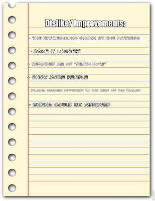
that it was maybe too dark in some shots. The main problem addressed by many of
the audience was the scream at the end of the trailer, as it was too high frequency
and there was a strong distinction between the level of the scream and the
effective soundtrack. One other thing that was brought up was the date at the
end, in which it zooms out to the point where you can see it is just an image.
We then posted our work via many other social networking sites such as Twitter
and BBM messenger. I posted the trailer on my Twitter account and messaged a
few friends on BBM.


This is a retweet from one of my followers on Twitter, in which he
retweeted "Great video i particularly love the choice of sound and fast
cuts towards the end". Based on this positive feedback, especially getting
this same comment from others, we realized that how we set up the pacing of our
trailer and sound effects were strong points.


Some more positive feedback from people via the Blackberry messenger. Based
on their comments I can that they particularly liked the shots used and the
cuts.
Here, I have recorded a few friends watching our group trailer. I think its important to be culturally diverse when gaining feedback, unfortunately, the audience was gender biased as there were no male companions at the time. However, I was able show our group trailer to a male audience and recieved positive feedback ("It was good! However, it would have been better if you could see what the boy (protagonist) was drawing more clearly, for example, shown the girl's (final girl) hair/ clothing then it would've been better").
As seen in the video clip above, the audience seemed to be watching intently and also displaying criticisms ("That's a bit dark, isn't it?") but the overall feel seemed positive as the girl in the middle exclaimed her likeness of our trailer towards the end.
I asked 3 questions to my audience, which are:


These were the answers I gathered:


Here, I have recorded a few friends watching our group trailer. I think its important to be culturally diverse when gaining feedback, unfortunately, the audience was gender biased as there were no male companions at the time. However, I was able show our group trailer to a male audience and recieved positive feedback ("It was good! However, it would have been better if you could see what the boy (protagonist) was drawing more clearly, for example, shown the girl's (final girl) hair/ clothing then it would've been better").
As seen in the video clip above, the audience seemed to be watching intently and also displaying criticisms ("That's a bit dark, isn't it?") but the overall feel seemed positive as the girl in the middle exclaimed her likeness of our trailer towards the end.
I asked 3 questions to my audience, which are:
- What did you like about the trailer?
- What didn't you like about the trailer?
- What can be improved?

These were the answers I gathered:

Evaluation Q2 - The Effectiveness of the Combination of Our Main Product & Ancillary Texts
Promoting a film is one of the most
important stages in creating a film. The movie industry uses this to advertise
and market their films, whether poster or trailer, via social networking sites
(Facebook, Twitter, etc.), streaming sites like YouTube, and placing posters on
billboards, bus stops and buses to name a few. To further promote films, actors
would usually be called for interviews with magazines, and this way the
audience can find out more about the film. Top films go as far as to marketing
their films through Cross Media Convergence – for example, the 2007 film Dark
Knight was made into a game, a XBOX 360 model was created for it, and also
Domino’s pizza would promote the film.


To give an idea of how our film would
look being advertised in different media, I have created mocked up versions of
where I would advertising using Photoshop:

Promoting Red Ink on Billboards
Film posters are advertising on billboards so even people driving cars
or on buses can see the poster.

Promoting Red Ink at Bus Stops
Whilst standing at bus stop, just to
pass the time, people would stare at the billboards at the shelter while
waiting for their bus, which may very well have the same poster being
advertised on the side!

Promoting Red Ink in the Newspaper
Newspapers would sometimes feature film
posters. I decided to advertise the poster on an article based on a rape
charge, as I thought the mood fitted the movie well.

Promoting Red Ink on YouTube
The art of promotion was well thought out through our many group discussions. As seen in the images above, our "RED INK" poster has been manipulated into common/ obvious places for advertisment. This was done by using PhotoShop which really helped create a more realistic vision of how our trailer would be advertised. By promoting our tailer on billboards and bus stop shelters, I feel this would lead to successful promotion of our trailer as many people ride the bus and walk past billboards. I think that our poster is very unique, eye-catching and grim which is bound to turn heads.
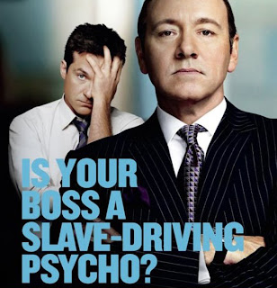
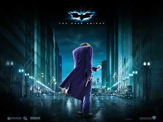 Now, that our poster has caught attention, it is natural for people to want to know more and further their opinion of our trailer by heading over to YouTube to view the real thing. Also, (as noticed above) there is an image of our poster that has been manipulated in a way that doesn't reveal too much, which will lead to people wanting to view our trailer even more. This has been done by many films, such as "Horrible Bosses", "The Dark Knight" etc.
 By taking over YouTube, in terms of advertisment, I think that this a brilliant way of really reaching out towards target audiences, as people of many ages visit YouTube and all most everything is online now, which helps add to views on YouTube. For others, who prefer to pick up a newspaper/ magazine and read about our trailer, this can be done as our "RED INK" poster has been manipulated into a section of a local newspaper. I think this is another effective way of advertising as it doesn't exclude those who prefer reading. In addition, a common way of advertising would be via televison however, I think that our group decided to not follow convetions and promote our trailer in a more social way, rather than discussing it in the home but by advertsing our trailer in so many different places; the cost is bound to be expensive. Therefore, advertising via television would definitely be the cheaper option. Overall, I think our advertising ideas are very effective and would lead to a successful promotion and film release.
 Now, that our poster has caught attention, it is natural for people to want to know more and further their opinion of our trailer by heading over to YouTube to view the real thing. Also, (as noticed above) there is an image of our poster that has been manipulated in a way that doesn't reveal too much, which will lead to people wanting to view our trailer even more. This has been done by many films, such as "Horrible Bosses", "The Dark Knight" etc.
  By taking over YouTube, in terms of advertisment, I think that this a brilliant way of really reaching out towards target audiences, as people of many ages visit YouTube and all most everything is online now, which helps add to views on YouTube. For others, who prefer to pick up a newspaper/ magazine and read about our trailer, this can be done as our "RED INK" poster has been manipulated into a section of a local newspaper. I think this is another effective way of advertising as it doesn't exclude those who prefer reading. In addition, a common way of advertising would be via televison however, I think that our group decided to not follow convetions and promote our trailer in a more social way, rather than discussing it in the home but by advertsing our trailer in so many different places; the cost is bound to be expensive. Therefore, advertising via television would definitely be the cheaper option. Overall, I think our advertising ideas are very effective and would lead to a successful promotion and film release.
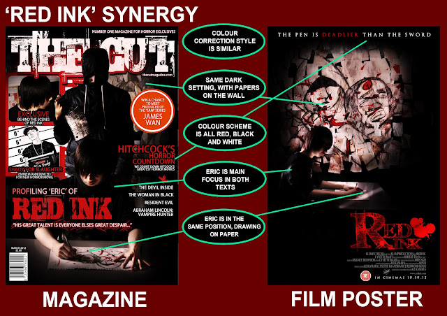
When creating the trailer, we knew it was important to make sure the poster and magazine had the same style in terms of lighting, colour and setting. Because of this, when creating the poster and magazine we were sure to use pictures that feature the main character Eric in a dark room, which is the same setting used for the trailer. We also made sure to keep the same style of font, all being serif fonts, and the colour scheme stays as black and red. The poster and magazine both feature Eric in a drawing position, just as he is drawing throughout the trailer.
Evaluation Q1 - Conventions of Our Magazine and Poster

MAGAZINE CONVENTIONS
Main coverlines should always promote the movie. In this case, the main
coverline relates to our movie ‘red ink’ and the main character. I made this in
bold, larger than any coverline so it stands out it is the same font as the
masthead so they are the main focus of the magazine front cover. ‘The Cut’ is our
masthead, which is positioned behind the killers head mainly so that the title
does not interfere with the main image, which is very important. We have also
included a selling line which is positioned above the masthead which is ‘Number
One Magazine For Horror Exclusives’. There are other articles place
on the magazine front cover, for two of the articles I used images to emphasise
their importance, so they can catch the attention of the audience. I used the
same colour scheme of red, black and white in the film poster so as to keep the
synergy the same. I also included a puff, a competition promotion, a barcode
with the date and price visible.

POSTER CONVENTIONS
I noticed that a convention that is not
always used in horror posters, seen mostly in psychological/supernatural
posters, is the use of negative space around a subject. This creates the effect
of building paranoia and a sense of unknowing what could happen around the
subject, and I decided that this would be really effective for my poster seeing
as it’s based on an artist in a dark room. It also helps to portray him as a
dark minded person.
I decided that I wanted my poster to be
different to most, and after looking up other film posters, I noticed that not
all main images were in the centre of the poster. I really liked this style, so
I moved the main image to the left side of the poster, and kept the text on the
right side of the poster. I used serif fonts for all my text, including my main
title ‘Red Ink’, which I used the font ‘FFF Tusj’ to create. I chose this font,
and also chose to use the red, black and white colour scheme, as I felt it
worked well with the idea of the film – a killer artist. I also added the 18
certificate and credit underneath the title,
and the selling line being ‘The pen in deadlier than the sword’, a play
on the idiom ‘The pen is mightier than the sword’.
Evaluation Q1 - How Our Media Production Use, Develop or Challenge Conventions
When deciding on our trailer and agreeing on the idea we had came up with, we had to decide on what horror sub-genre would best fit the content of our trailer. We realized that because of the story idea being based around a boy who creates drawings that come to life, it would be of a supernatural sub-genre – but we would end up with a hybrid of both supernatural and slasher because of the fact that there is a main killer who using a knife as a weapon – one of the main conventions in the slasher sub-genre.
The idea of having a killer in the movie came from watching trailers and movies from the Friday the 13th Series. I was really interested in how the trailer for 2009’s trailer for the Friday the 13th remake done well to build up the Jason character, and how it is only at the end where we see Jason attack his victim with a weapon. (SEE TRAILER ANALYSIS): http://slamproductions4.blogspot.com/2011/12/textual-analysis-of-teaser-trailer_13.html)
Watching trailers from the supernatural horror sub-genre helped us to understand the trend that is seen in the trailers. One of the main conventions in the supernatural/psychological sub-genre is the idea of appealing to the audience’s mind. It tends to make them think that situations brought up in a trailer/film may actually be real, and allows them to feel paranoid as to what may occur in the trailer/film.
Referring to the conventions for slashers, we decided to use the final
girl convention by having a girl being attacked by a man with a knife in the
shadows, and this would be at the end of the trailer. This would be the only
instance of violence in the trailer, and we chose to put it at the end so the audience could pay attention to Eric’s
disturbed mind, and to also build paranoia in the audience, helping us to
achieve our supernatural and physiological convention. The knife is a common
convention used in slasher movies, and so we decided to use this weapon in our
trailer for this scene.
The female would help us achieve our
target audience of 18-34 year olds. We also chose to keep simple clothing for
costume, and the girl wore a tank top, to follow the theory that the females in
horror tends to dress slightly revealing. The killer, who is male, grabs the
female victim by the neck and drags her away, showing him to be dominant, thus
representing males as the dominating sex – something that Slasher films tend to
do. When filming, we also made sure not to show neither the artist’s, nor the
murderer’s face, another convention of the killer’s face being hidden. We used
the Diva Lite to light up the actors in order to see them, but during editing
we adjusted the colour correction to create a low key lighting effect. Blood is
another convention seen in Slashers, so we applied blood on Eric’s hand and
paper to make it seems as if he had killed people already, a conclusion which
the audience would automatically draw to, especially because of the drawings on
the wall. We realized that there are hardly any slasher movies that have a
black final girl, so we chose to do this instead of the common innocent
Caucasian female.

Supernatural
and psychological films are usually created to give the audience a level of
realism. It is to get the audience to react to what is being showed to
them. The reaction the producers are looking for is for the audience to
feel as if what they are watching is actually real and they are part of
what is going on. Within our teaser trailer, a number of
drawings are showed, except for the main drawing shown which actually comes to
life at the end of the trailer. This would have the audience imagining the
drawings coming to life in their heads. We decided not to show the main drawing
as we believed the audience would be able to figure out the idea of the story,
through the final girl’s reaction, and the attack at the end.
Another
convention that supernatural/psychological trailers tend to achieve is
disturbing the human mind. Within our teaser trailer, on the psychological side
of things, we used quick cuts showing different drawings and Eric's hand in
drawing motion and with his hands covered in blood, helping to give an insight
on how dark his mind is. Also the background music that was used was to help
build up this image to let the audience know that he is indeed a disturbed
soul. To create
realism, we exposed Eric’s insane viewpoint. We used tracking shots a lot when
it came to showing the pictures on the wall. This was because we wanted the
audience to feel as if they are walking in the room and looking at the images.

TRAILER CONVENTIONS WE FOLLOWED/ CHALLENGED/ DEVELOPED :
· 30-1 minute trailer – the trailer is 30 seconds long
· Quick cuts – there is quite a few quick cuts in the trailer as it progresses, eventually returning
· Colour correction – we adjusted the colour of the trailer to create a much darker, cold mood
· Minimum footage to make people want to see more – we have a shock part at the end of the trailer where the female victim is attacked by a hidden male killer, and we cut it at this point.
- The main character is a young Asian male yet our trailer is not a J- Horror genre, which tends to use Asian actors.
- Captions were used to create suspense
- Tension is built throughout trailer, the scream of the final becomes the climax
Friday, 24 February 2012
Shooting Script
Shooting Script
1st Shot:
· Tracking shot (Main character – Eric)
· Situated in a dark room
· Props included: artwork, table, chair
(Fade in to) 2nd Shot:
· Medium close up/ tracking shot (of Eric’s hand)
· Props included: pen, paper, table
· Make-up: fake blood
(Cut to) 3rd Shot:
· Extreme close up (of Eric’s eye)
(Cut to) 4th Shot:
· Tracking shot (of artwork)
· Prop(s) included: artwork
(Fade out to) CAPTION
(Cut to) 5th Shot:
· Medium shot/ tracking shot (of Eric)
· Props included: table
· Make up: fake blood
(Cut to) 6th Shot:
· Close up (of Eric’s hand)
· Prop(s) included: pen
· Make up: fake blood
(Cut to) 7th Shot:
· Extreme close up (of Eric’s eye)
(Cut to) 8th Shot:
· Tracking shot (of artwork)
· Props included: paper, artwork
(Fade out to) CAPTION
(Fade out to) 9th Shot:
· Extreme close up (of Eric’s hand)
· Props included: pen, table
(Cut to) 10th Shot:
· Extreme close up (of Eric’s eye)
(Cut to) 11th Shot:
· Tracking shot (of artwork)
· Prop(s) included: artwork
(Fade out to) 12th Shot:
· Medium shot (of Eric’s hand)
· Props included: pen, table
· Make up: fake blood
(Quick cut to) 13th Shot:
· Medium close up (of Eric drawing)
· Props included: pen, table
· Make up: fake blood
(Cut to) 14th Shot:
· Extreme close up (of Eric’s eye)
(Cut to) 15th Shot:
· Tracking shot (of artwork)
· Prop(s) included: paper
(Quick cut to) 16th Shot:
· Extreme close up (of Eric’s hand)
· Props included: pen, table
(Quick cut to) 17th Shot:
· Over-the-shoulder shot
· Props included: pen, table
(Quick cut to) 18th Shot:
· Extreme close up (of Eric’s eye)
(Fade out to) 19th Shot:
· Tracking shot (of artwork)
· Prop(s) included: artwork
(Quick cut to) 20th Shot:
· Close up (of Eric’s hand movement)
· Props included: pen, paper, table
(Quick cut to) 21st Shot:
· Extreme close up (of Eric’s hand)
· Prop(s) included: pen
(Quick cut to) 22nd Shot:
· Extreme close up (of Eric’s eye)
(Fade out to) 23rd Shot:
· Close up (of artwork)
· Prop(s) included: artwork
(Quick cuts to) 24th – 44th Shot:
All previous shots (close up’s, extreme close up’s etc.) will have quickened to create a climax of the trailer.
(Black out to) 45th Shot
(Fade out to) 46th Shot:
· Tracking shot (of “Final girl”)
· Props included: artwork, paper, table, chair
(Cut to) 47th Shot:
· Pan shot (of “Final girl” picking up artwork)
· Props included: artwork, table
(Cut to) 48th Shot:
· Over-the-shoulder shot (of artwork)
· Prop(s) included: artwork
(Cut to) 49th Shot:
· Medium shot (of “Final girl” being attacked by the hooded antagonist)
· Prop(s) included: Knife
Caption (of “RED INK”)
Caption (of “Coming Soon)
Subscribe to:
Posts (Atom)